- What did users do immediately after signing up?
- Where are users getting confused or stuck?
- Which parts of your app people are actually using?
- Why users aren’t discovering new features?
- Where new users are landing on your website?
How to analyze user paths
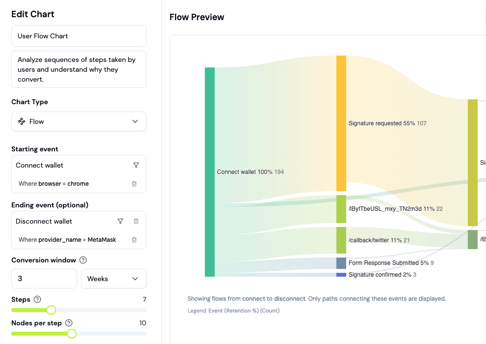
User flows show you the actual paths users take through your app, not just the paths you designed. This guide walks you through creating and analyzing flow charts.What is a Sankey diagram?
A Sankey diagram visualizes user journeys as flowing paths. The width of each path represents the number of users taking that route. Wider paths = more common behavior. Unlike funnels (which track a specific sequence), flows reveal all paths users take, including unexpected ones.Step 1: Create a Flow chart
Flows are a chart type you add to a dashboard (board), not a separate nav page.- Go to the Formo Dashboard
- Select your project
- Open Dashboards in the left navigation, then open or create a board
- Click Add Chart and choose the Flow chart type
Step 2: Choose your starting point
Flows can start from any event. Select what you want to analyze:| Starting point | What you’ll learn |
|---|---|
| First visit | Where users go after landing |
| Wallet connect | What users do after connecting |
| Specific page | Paths from a key page |
| Custom event | Behavior after a conversion point |
Step 3: Configure the flow
- Select Starting event (e.g.,
connect) - Choose Direction:
- Forward: What happens after this event
- Backward: What led to this event
- Set Number of steps (typically 3-5)
- Click Generate
Step 4: Read the flow chart
The Sankey diagram shows:- Nodes: Events (pages, actions, conversions)
- Paths: User journeys between events
- Width: Number of users (wider = more common)
- Drop-off: Users who left the flow
Step 5: Identify patterns
Look for these insights: Common paths:- Wide paths show your most frequent user journeys
- Do they match your intended UX flow?
- Narrow paths to unexpected destinations
- Users skipping steps or taking detours
- Where do users leave the flow?
- High drop-off at certain pages = friction points
Example: Post-connect analysis
Analyze what users do after connecting their wallet: | Starting event |connect |
| Direction | Forward |
| Steps | 4 |
Typical findings:
- 60% go to
/swap(expected) - 20% go to
/portfolio(checking balances) - 10% disconnect immediately (issue with UX?)
- 10% navigate to
/docs(need help?)
Example: Path to conversion
See how users reach a conversion event: | Starting event | Your conversion event (e.g.,Swap) |
| Direction | Backward |
| Steps | 3 |
Questions to answer:
- What pages do converters visit first?
- Do they explore multiple features before converting?
- Is there a common path to conversion?
Use flows with funnels
Flows and funnels complement each other:| Tool | Best for |
|---|---|
| Funnels | Measuring specific conversion paths |
| Flows | Discovering all paths (expected and unexpected) |
- Use Flows to discover common paths
- Create Funnels to measure conversion on those paths
- Use Flows again to investigate drop-off points
Next Steps
Funnels
Measure conversion on specific paths
Activity Feed
Review individual user journeys
Custom Events
Track more touchpoints for flow analysis
Wallet Profiles
Drill into specific user journeys