Understanding dashboards
- Dashboards is the section in the sidebar where you manage your visualizations
- Boards are individual dashboard pages that contain multiple charts
- Charts are the visualizations within each board
SQL Editor Autocomplete
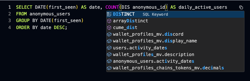
Use a SQL editor to query your data however you want. The SQL editor supports autocomplete for:- Table names
- Table columns
- Clickhouse SQL keywords and functions
Ask AI
Use the Ask AI feature (the AI assistant) from anywhere on the dashboard to build charts and explore your data. Ask AI to generate queries, explore patterns, surface anomalies, and recommend actions.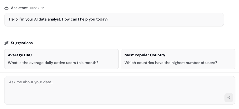
- Build custom charts and save them to your dashboard
- Answer questions about your data
- Generate SQL queries based on natural language
- Surface hidden insights and patterns
Text to SQL
Ask AI to write and fix SQL code based on your instructions.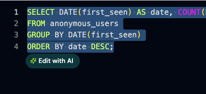
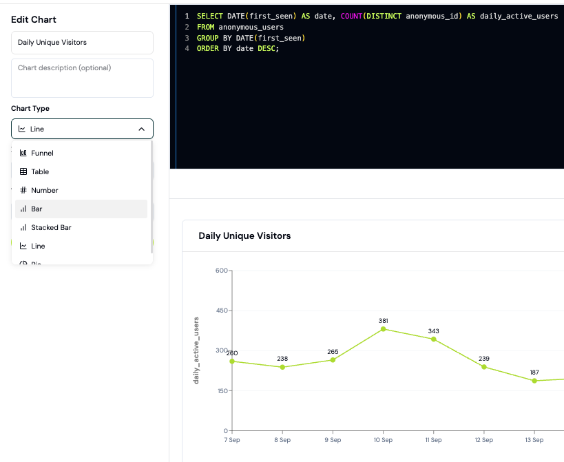
Chart Types
Here is the current list of supported chart types on Formo:- Funnel
- Flow
- Retention
- Table
- Number
- Bar
- Stacked Bar
- Line
- Area
- Pie
Export CSV
Export data into a CSV file for use elsewhere in your stack.How to build your first dashboard
Create a custom dashboard with charts to track your key metrics. This guide walks you through creating charts using both SQL and the AI assistant.Step 1: Create a board
- Go to the Formo Dashboard
- Select your project
- Click Dashboards in the left navigation
- Click Add board to create a new dashboard
- Click Add Chart to add your first visualization
Step 2: Create a chart with Ask AI (Recommended)
The easiest way to create charts is using natural language:- Click Ask AI in the sidebar
- Describe what you want to see:
- “Show me daily active users over the last 30 days”
- “What are my top 10 referrers by transaction count?”
- “Chart wallet connects by country this month”
- AI generates the SQL query and chart
- Click Save to Dashboard
| Prompt | What you get |
|---|---|
| ”Daily unique wallets last 7 days” | Line chart of wallet connects |
| ”Top pages by views” | Bar chart of page rankings |
| ”Conversion funnel from visit to transaction” | Funnel visualization |
| ”Week-over-week retention” | Retention cohort table |
Step 3: Create a chart with SQL
For more control, write SQL directly:- Click New Chart > SQL Editor
- Write your query using Formo’s schema
- Click Run to preview results
- Choose your visualization type
- Click Save
Step 4: Choose a visualization
After running your query, select the chart type that best represents your data:| Chart Type | Best for |
|---|---|
| Line | Trends over time |
| Area | Cumulative trends over time |
| Bar | Comparing categories |
| Stacked Bar | Comparing categories across segments |
| Pie | Showing proportions |
| Number | Single KPI metric |
| Table | Detailed data exploration |
| Funnel | Conversion analysis |
| Retention | Cohort retention |
Step 5: Organize your board
Arrange charts into a dashboard layout:- Open your board from Dashboards in the sidebar
- Drag charts to rearrange
- Resize charts by dragging corners
- Group related metrics together
- Top row: Key numbers (DAU, revenue, transactions)
- Middle: Time-series trends
- Bottom: Breakdowns and tables
Step 6: Share your dashboard
Share insights with your team:- Export - Download individual charts as CSV
- Share link - Generate a view-only dashboard link
- BI tools - Connect Metabase, Tableau, or other tools via direct database access
Example: Weekly metrics dashboard
Here’s a starter dashboard with common metrics:| Chart | Query description | Type |
|---|---|---|
| WAU | Unique wallets last 7 days | Number |
| Daily trend | Visitors per day last 30 days | Line |
| Top referrers | Referrers ranked by visitors | Bar |
| Conversion rate | Visitors who transacted | Number |
| Country breakdown | Users by country | Pie |
Next Steps
Ask AI
Learn more about AI-powered analytics
Data Catalog
Explore available tables and columns
BI Tools
Connect external visualization tools
Funnels
Build conversion funnels