Part 1: View Retention on the Overview Page
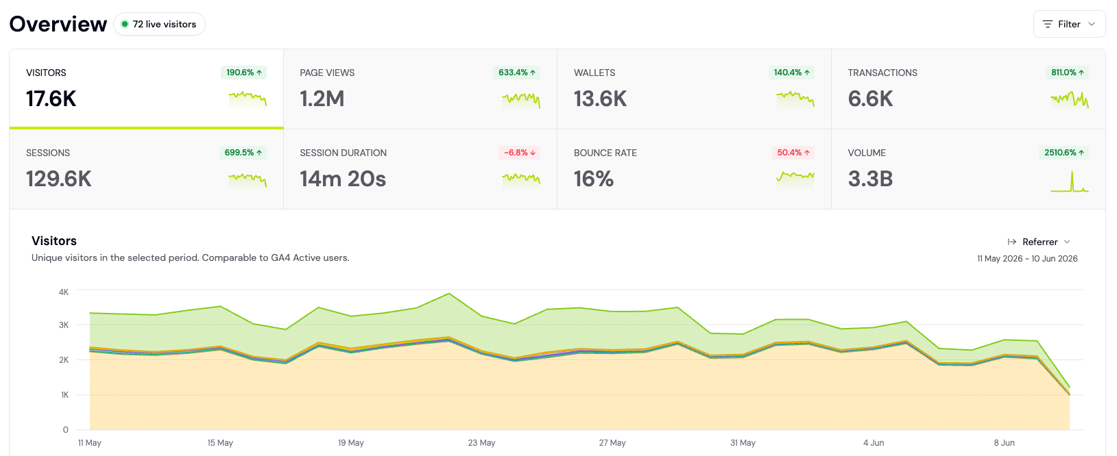
The fastest way to see retention is on your Overview dashboard:Scroll down to the Retention section. You’ll see:
- Day 7 Retention: Percent of users active on Day 7 (default 14-day window)
- Day 30 Retention: Percent of users active on Day 30
- Day 90 Retention: Percent of users active on Day 90
- Delta: Week-over-week change (up or down)
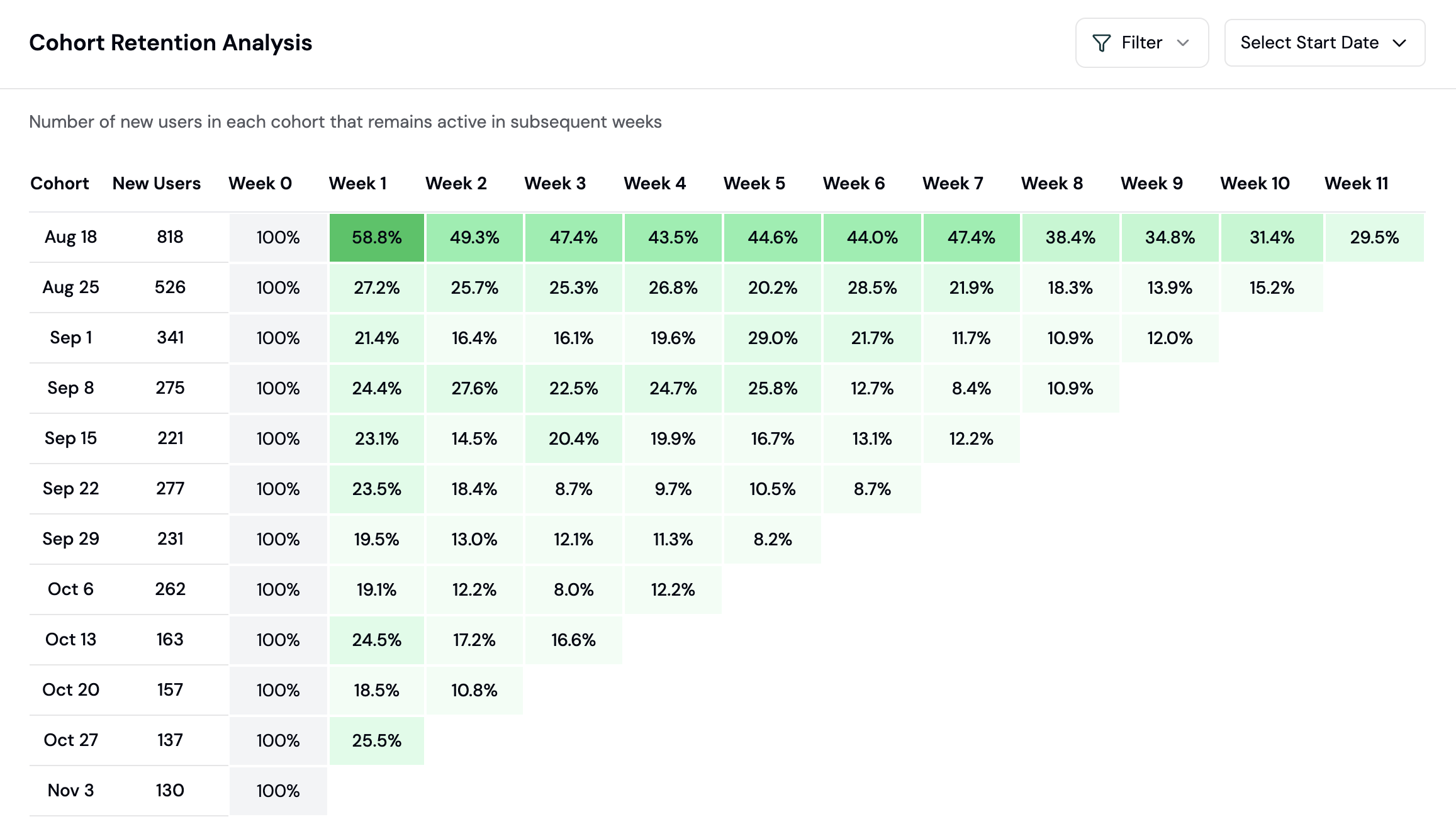
Part 2: Build a Retention Cohort Chart
For deeper insights, create a retention cohort chart on a dashboard. This shows how each cohort of users (grouped by signup date) retains over time:Choose your cohort grouping:
- Daily: See retention of users who signed up on each day
- Weekly: Group by signup week (cleaner view for smaller apps)
- Monthly: For apps with high volume
- Declining diagonal: Older cohorts have worse retention. (Possible: product degraded, new cohorts are higher quality)
- Level diagonal: Consistent retention across all cohorts. (Healthy.)
- Rising diagonal: Newer cohorts retain better. (Possible: product improvements are working)
Part 3: Identify Churn Patterns
The Insights page uses AI to spot churn signals. Check it weekly:Look for the Issues section. Formo flags patterns like:
- “Users from country=US are churning 25% faster than average”
- “Mobile users have 40% lower Day 7 retention”
- “Cohort from Week 3 of March dropped 15% on Day 5”
- A sudden drop in Day 7 retention (5%+ week-over-week) usually means a bug or product issue
- A specific geography or device churning faster suggests a UX or localization problem
- A cohort that performs poorly across all retention windows suggests they were bad-fit users to begin with
Part 4: Segment Churned and At-Risk Users
To re-engage users, you must first identify them. Use the Users page to create segments:Apply filters to find at-risk users:
- Lifecycle = “Churned”: Users inactive for 30+ days
- Lifecycle = “Resurrecting”: Users who returned after being inactive
- Last Activity < 7 days ago: Users who haven’t returned this week
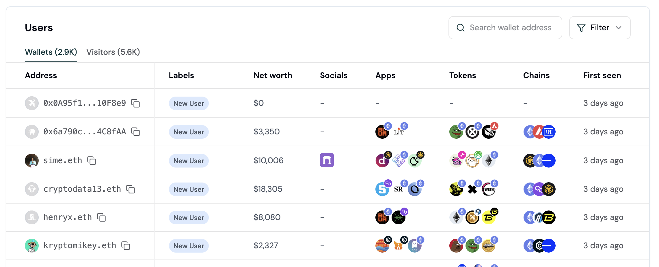
User Lifecycle Stages: New, Returning, Power User, Resurrected, At Risk, and Churned, assigned from each wallet’s activity recency and frequency. See User Lifecycle for the exact rules and thresholds.Use these stages to build segments for targeted campaigns.
Part 5: Export Your Segment for Re-Engagement
Part 6: Set Up Alerts for Key User Events
Monitor important user activity with alerts. Get notified when high-value wallets connect or key events happen:Configure your alert trigger (e.g., whale wallet connects, transaction from a high-value user). Choose notification method (Slack webhook).
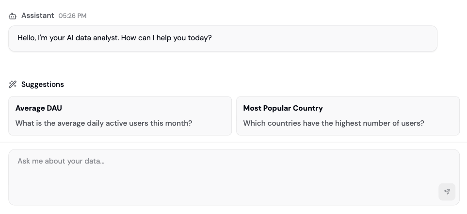
Part 7: Use Ask AI to Understand Churn
Open Ask AI (the AI assistant) and ask natural language questions:- “Why is Day 7 retention down 10% this week?”
- “Which countries have the worst retention?”
- “Do mobile users churn faster than web?”
- “What do my highest-retaining users have in common?”
Real-World Example: Improving Retention by 5%
Scenario: Your DEX app has 25% Day 7 retention. You want to hit 30%.Identify the problem (Week 1): Create a retention cohort chart. See that mobile users churn 15 points faster than web.
Understand the why (Week 2): Use Ask AI: “Why are mobile users churning faster?” Discover: mobile users have 3x higher transaction failures due to a timeout issue.
Measure impact (Week 4): Create a segment of “mobile users who upgraded on Day 3”. Compare their Day 7 retention vs old cohorts. See 8% improvement in that segment.
Best Practices
- Weekly deep dives: Check Insights every Monday. Act on red flags immediately.
- Cohort comparisons: Compare Week 1 vs Week 2 cohorts. Which is healthier? Why?
- Segment tests: Create two segments (e.g., “High fee payers” vs “Low fee payers”). Compare retention. High spenders often retain better, revealing your value lever.
- Pair with conversion: High conversion doesn’t mean high retention. A user who swaps once and never returns is not a retained user. Optimize for both.
- Monitor by source: Create segments by referrer. Which traffic sources give best-retaining users? Double down there.
- Check wallet labels: If you use Wallet Intelligence, segment by wallet label (e.g., “Verified Coinbase User”). Some labels correlate with higher retention.
Churn Prevention Playbook
Churn isn’t just “users who left.” It’s a measurable, predictable pattern. Use this playbook to define, detect, and prevent churn in your specific app. Churn Definition by App Type| App Type | Churn Threshold | Rationale |
|---|---|---|
| DeFi (DEX, Lending) | 30+ days | Long gaps between trades are normal, but 30 days suggests abandonment |
| Gaming | 14+ days | Daily drivers; 2 weeks without a session signals churn |
| Bridge/Cross-chain | 60+ days | Multi-week cycles are normal; 60 days is the safety threshold |
Create these three segments in the Users page and save them for weekly monitoring:
-
At-Risk Power Users (High priority)
- Filter:
Sessions > 20ANDLast Activity 7-14 days ago - Why: These users have proven value. Re-engage before they churn.
- Filter:
-
New Users Not Returning (Medium priority)
- Filter:
Sessions < 5ANDLast Activity 3-7 days ago - Why: Early-stage friction. A small push converts them to returning users.
- Filter:
-
Declining Activity (Watch list)
- Filter:
Sessions > 10ANDLast Activity 7-30 days ago - Why: Gradual drop-off. These need incentives before hitting 30+ days.
- Filter:
- Whale Going Inactive: User with
Lifetime Value > $10kANDLast Activity > 7 days - Power User Declining: User with
Sessions > 15ANDDay-over-day activity drop > 50% - Failed Transaction Spike: Cohort-level alert if
Failed Transactionsincrease 3x week-over-week
| Segment | Trigger | Action | Expected Lift |
|---|---|---|---|
| Power users going quiet | 7 days of inactivity | VIP email + bonus points | 15-25% return |
| New users stalling | 3 days, fewer than 5 sessions | In-app nudge + tutorial replay | 20-30% return |
| Recently churned | 30-45 days inactive | ”We miss you” discount offer | 10-15% return |
- Go to Dashboards > Add Chart > select Flow
- Filter by users whose lifecycle is Churned
- Look for patterns: failed transactions, abandoned flows, or limited exploration
- Churned cohort: Active 60+ days ago, has not returned in 30+ days
- Retained cohort: Active 60+ days ago, has returned in the last 30 days
Next Steps
You’ve set up retention tracking. Here’s what to do next:- Create a Conversion Funnel: High retention is good, but you need high conversion first.
- Use Segments for Re-engagement: Build audiences of churned users for campaigns.
- Build a Custom Dashboard: Track retention alongside other key metrics in one view.
- Set Up Alerts: Get notified when high-value users or key events happen.
- Explore Your Users: Click on a user in the Users page to see their full profile, including lifecycle stage and activity feed.
FAQ
How is retention calculated?
How is retention calculated?
Day 7 retention = (Users active on Day 7 / Users who signed up on Day 0) * 100A user is considered active if they have at least one session (page view or transaction) on that day.Example: 1000 users sign up on Monday. 250 of them return and are active on the following Monday. Day 7 retention = 25%.
What's the difference between Day 7, 30, and 90 retention?
What's the difference between Day 7, 30, and 90 retention?
- Day 7: Users who returned within 7 days of signup. Measures short-term activation.
- Day 30: Users active within 30 days. Measures habit formation.
- Day 90: Users active within 90 days. Measures long-term value.
What user lifecycle stage should I re-engage first?
What user lifecycle stage should I re-engage first?
Priority order:
- Resurrecting: Users who just came back. Momentum is on your side.
- At-risk Returning: Users with only 2-3 sessions. Easy to convert to Power Users.
- Recent Churned: Users inactive for 30-60 days. Still remember your product.
- Old Churned: Users inactive for 6+ months. Hard to re-activate.
Can I compare retention across different UTM sources?
Can I compare retention across different UTM sources?
Yes. Create two retention charts (or use breakdowns). Filter the first by UTM Source = “twitter” and the second by UTM Source = “discord”. Compare Day 7 retention across both. You’ll likely see significant differences.If one source has 2x better retention, invest more in that channel.
Can I set a custom retention window?
Can I set a custom retention window?
By default, retention is measured from signup date. You can create custom cohort charts by setting a custom event (e.g., “first_transaction”) as your cohort start. Contact support if you need help.