Part 1: Navigate to Dashboards and Create a Flow Chart
In the Formo dashboard:- Click Dashboards in the sidebar
- Click Add Chart in the top right.
- From the chart type selector, choose Flow.
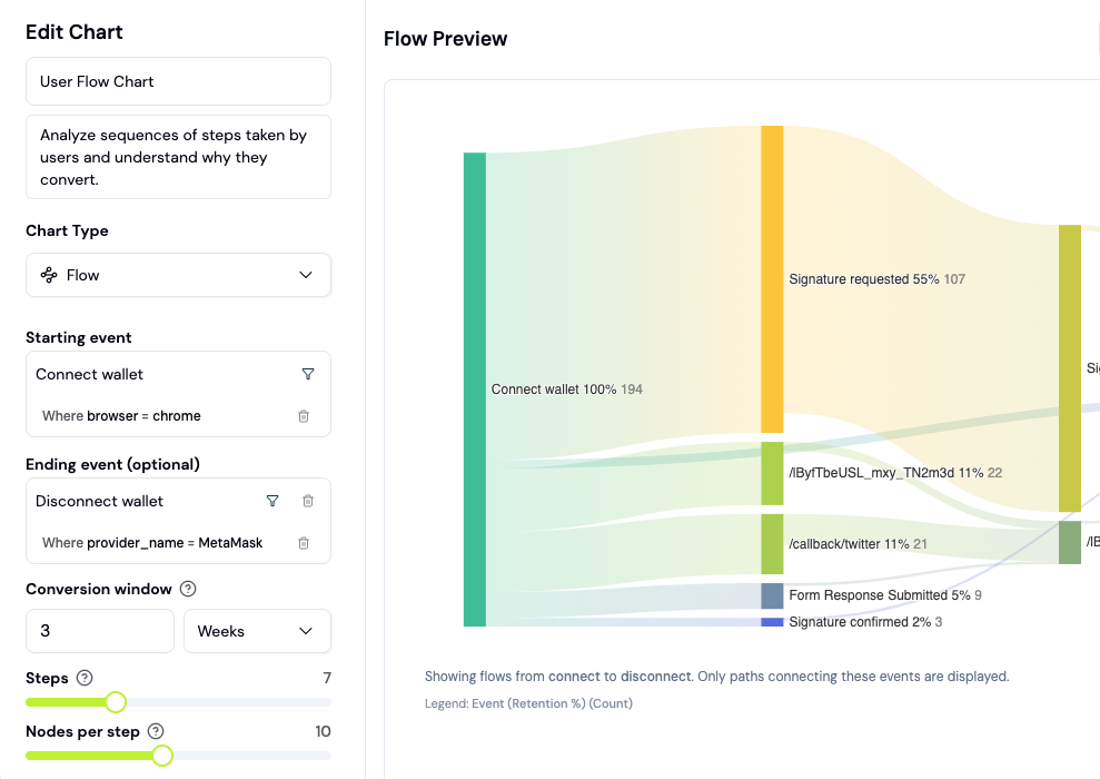
Part 2: Configure Your Starting Event
In the flow builder, select your starting event. Common starting points for onboarding analysis:- First page view (shows the complete user journey from landing)
- Connect wallet (shows post-connection paths)
- Account Signup (tracks authentication flow)
Part 3: Read the Sankey Diagram
The diagram shows:- Nodes (circles): Pages or events in your flow (e.g., “Swap Page”, “Portfolio”)
- Paths (arrows): Lines connecting nodes, thickness represents user volume
- Drop-off (gray paths exiting right): Users who left without continuing
Part 4: Analyze Forward Paths
Forward paths answer: “What did users do after this step?” Example questions:- After connecting their wallet, how many users visited the portfolio page?
- Of those who visited the portfolio, how many completed a transaction?
- What’s the most common second step after landing?
Part 5: Analyze Backward Paths
Backward paths answer: “What did users do before this step?” This is critical for understanding onboarding friction. Example:- Users who completed a swap typically visited the “How It Works” page 2x first
- Users who bounced typically skipped the tutorial
Part 6: Filter by User Properties
Click Filter to narrow the flow to specific user segments. Filter options:- New Users Only (lifecycle = New)
- By Referrer (organic vs paid, specific campaigns)
- By Device (mobile vs desktop dropoff patterns)
- By Wallet Label (verified, high-net-worth wallets)
- By Chain (Ethereum users vs Polygon users)
Part 7: Identify Bottlenecks and Optimization Opportunities
Look for:- Hard Stops: Nodes where 50%+ users exit (red flag for UX friction)
- Unexpected Paths: Routes most users don’t take (may indicate confusion)
- Long Paths: Users going 5+ steps before conversion (simplify)
- Device Disparity: Different conversion rates on mobile vs desktop
Part 8: Save Flow Chart to Your Dashboard
Once your flow analysis is complete, click Save to Dashboard. Choose an existing dashboard or create a new one. Name the chart clearly: “New User Onboarding Flow” or “Post-Swap Flows”. Saved flows update in real time, so you can track onboarding improvements over time as you ship fixes.Real-World Analysis Walkthrough
Imagine your new user onboarding flow shows:- 100 users land on your app (starting event: first page view)
- 80 connect a wallet (80% conversion)
- 60 visit swap page (75% of wallets)
- 20 complete first swap (33% of swap visitors)
- Wallet connect: Strong (80% is good)
- Swap page visit: Good (75%)
- Swap completion: Weak (33%)
Measuring Onboarding Success
Create onboarding segments
Use segments to track users at different onboarding stages: Segment 1: Landed but didn’t connect- Visited page in last 7 days
- Did NOT connect wallet
- Connected wallet in last 7 days
- Did NOT complete transaction
- Completed transaction in last 7 days
- Is a New User (lifecycle)
Measure with the onboarding rate formula
The “aha moment” drives retention
Compare retention for different first-session actions:| First session action | Week 1 retention |
|---|---|
| Only connected wallet | 15% |
| Viewed 3+ pages | 25% |
| Completed transaction | 45% |
Query onboarding rate with SQL
Common onboarding improvements
| Issue | Solution | How to measure |
|---|---|---|
| Low landing to app conversion | Clearer CTA, better messaging | Funnel step 1→2 rate |
| Wallet connect drop-off | Simplify options, add trust signals | Funnel step 2→3 rate |
| High bounce on app page | Improve loading speed, add guidance | Flows showing exits |
| Users don’t return | Email/notification follow-up | Week 1 retention |
A/B test onboarding changes
When you ship changes to improve onboarding:- Note the date of the change
- Compare funnel metrics before and after using date filters on your dashboard
- Check if retention improved for post-change cohorts using a Retention chart
Next Steps
Combine flow analysis with conversion funnels for deeper insights:- Build Conversion Funnels to measure step-by-step conversion
- Explore with SQL to query average time spent in each step
- Build a Dashboard to track onboarding KPIs weekly
FAQ
What's the difference between Flows and Funnels?
What's the difference between Flows and Funnels?
Flows show all possible routes users take, including dropoffs. Funnels measure conversion through a specific sequence of steps. Use flows to discover paths, funnels to measure specific conversions.
Can I set a time window for flows (e.g., only first 24 hours)?
Can I set a time window for flows (e.g., only first 24 hours)?
Yes. In the flow filter, add a condition like “Time Since Starting Event: < 24 hours” to see only the first day of user behavior.
What's the maximum number of steps a flow can show?
What's the maximum number of steps a flow can show?
Flows can show up to 20 steps deep, though clarity typically degrades after 7-8 steps. If your flow is too complex, filter to new users only or segment by user property.
Can I export flow data as a CSV or JSON?
Can I export flow data as a CSV or JSON?
Yes. Click Export in the chart menu to download node and path data. Useful for reporting to stakeholders or further analysis in Excel.