Part 1: Create Your Custom Board
Navigate to Dashboards in the sidebar. Click Add board. Name your board (e.g., “Growth Metrics” or “Protocol Health”). This is your custom dashboard page where all charts will live.Part 2: Add a Chart
Click Add Chart on your board. In the chart builder:- Select Line chart type (or Bar for comparison)
- Write a SQL query for your metric (e.g., daily unique wallets, transaction count) or load an example.
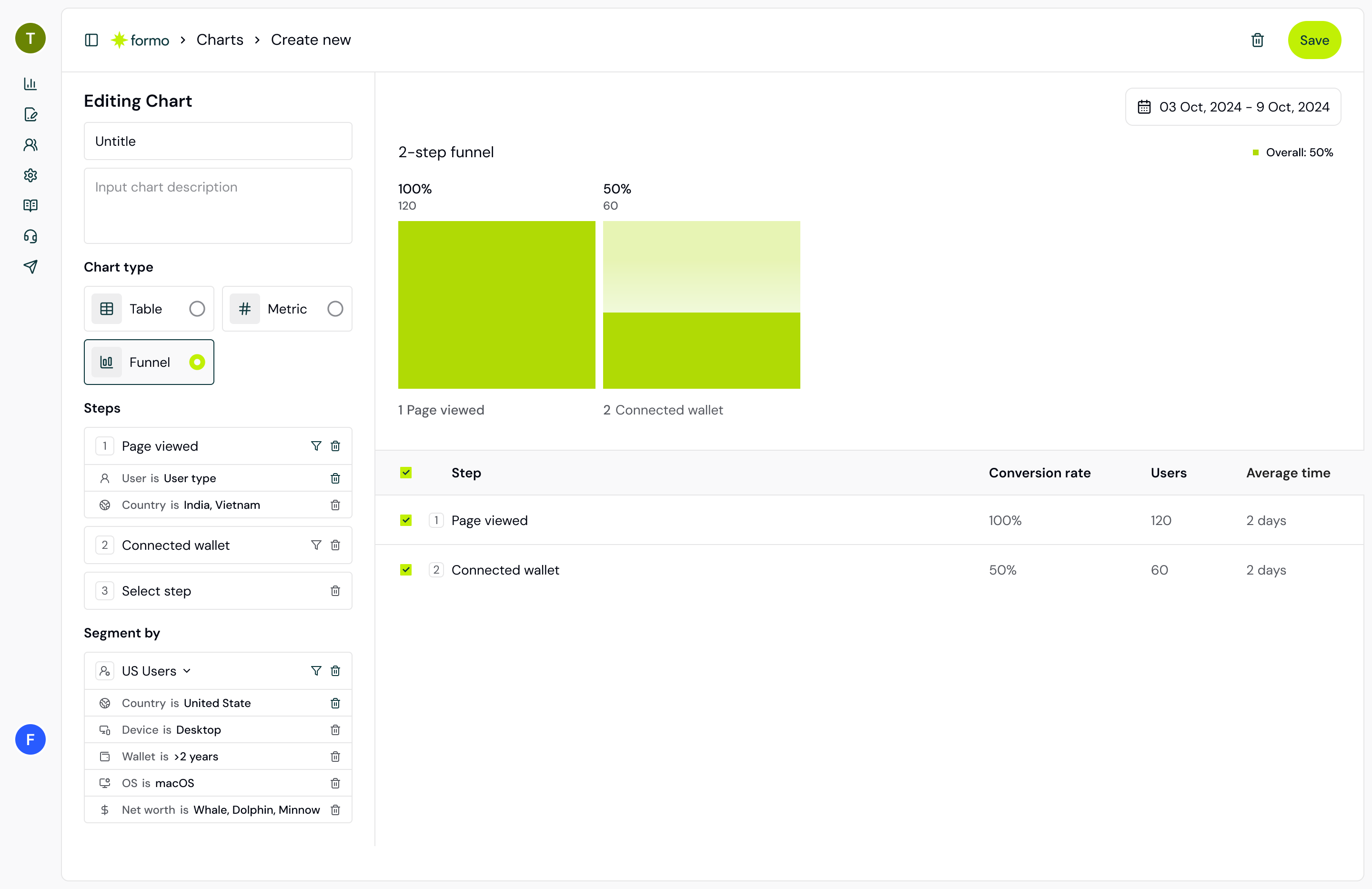
Part 3: Add Funnel Chart
Create a new chart:- Select Funnel chart type
- Define your funnel steps:
- Step 1: Page view (using the
pageevent type) - Step 2: Connect wallet (using the
connectevent type) - Step 3: First Transaction
- Step 4: Repeat Transaction (optional)
- Step 1: Page view (using the
- Set your time range (30 days)
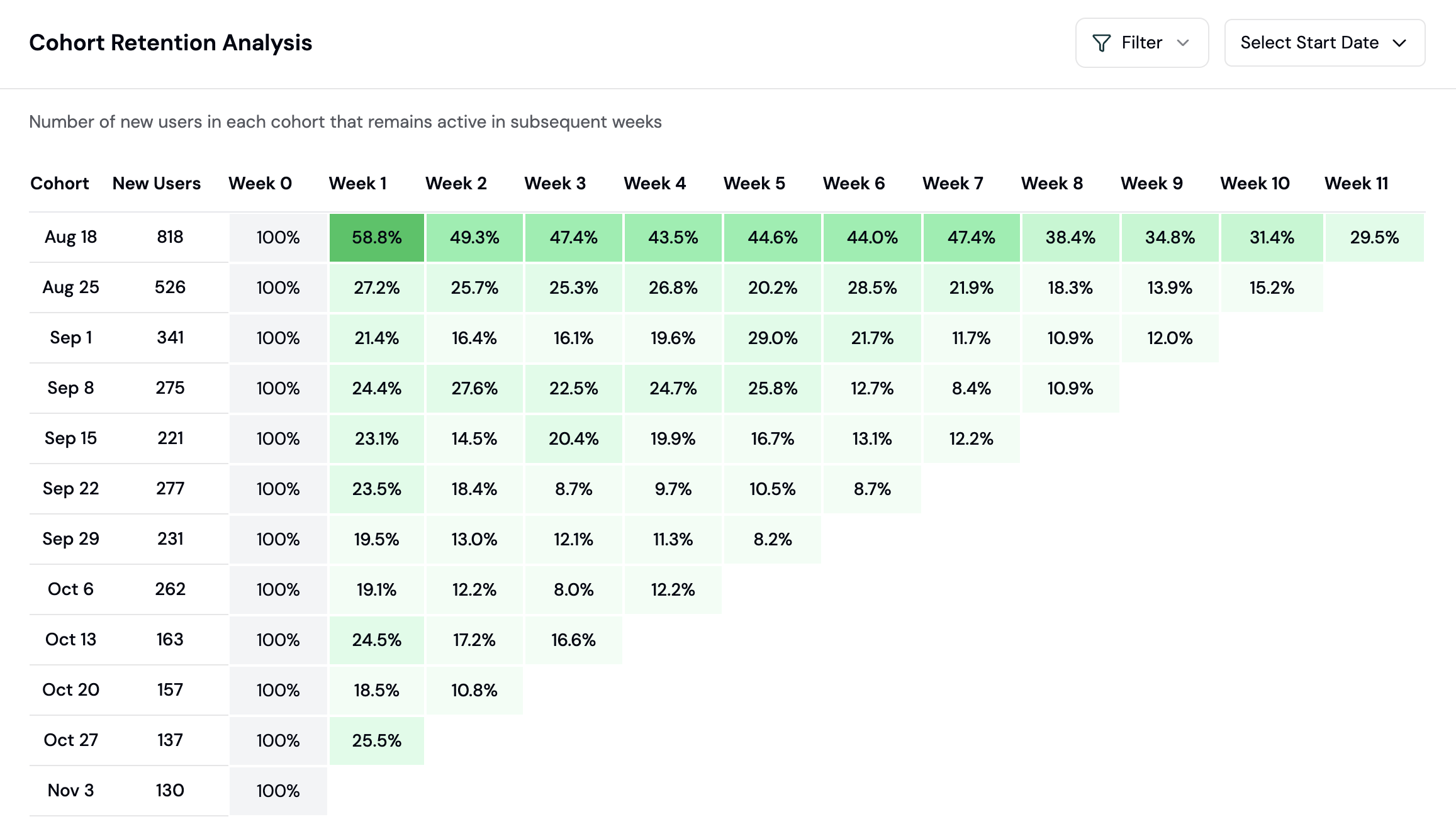
Part 4: Add Retention Chart
Create another chart:- Select Retention chart type
- Choose the retention event (e.g., wallet connect)
- Optionally add user filters to segment cohorts
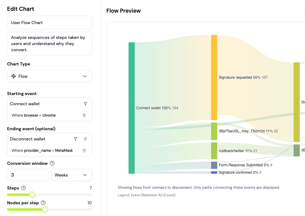
Part 5: Add Flow Chart (Sankey)
Create another chart:- Select Flow chart type (Sankey diagram)
- Configure: Page (or custom event) flows
- Limit to top 5-10 paths for clarity
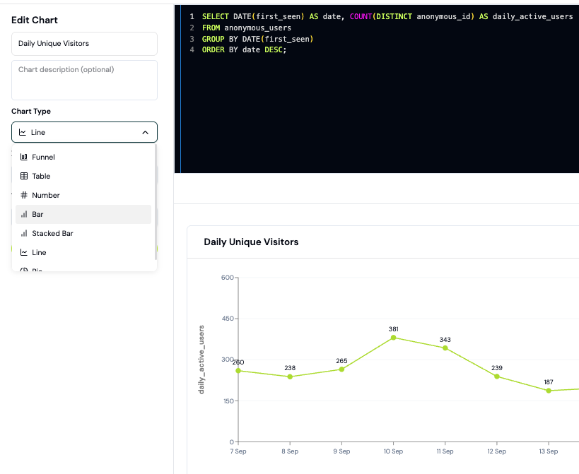
Part 6: Add Custom SQL Chart
For advanced metrics (daily revenue, top wallets, gas spent), use a custom SQL chart:- Click Add Chart and write a SQL query
- Open the Explorer to build and test your query first
- Paste your tested SQL into the chart builder
- Select your chart visualization (Line, Bar, Pie)
Part 7: Share Your Dashboard
Click Share in the top right to generate a public link. Copy it and share with stakeholders - all data updates in real time.Recommended Custom Charts
| Chart | Metric | Why It Matters |
|---|---|---|
| Key Metrics Line Chart | DAU, Transactions | Your protocol’s growth trajectory |
| Funnel Chart | Page view > Connect > Transaction | Where users drop off and your biggest opportunity |
| Retention Chart | D7, D30 cohort retention | Whether users actually come back (stickiness) |
| Traffic Sources | Referrer breakdown | Best acquisition channels to double down on |
| Flow (Sankey) | Common flows | How real users navigate your protocol |
Next Steps
- Create a conversion funnel to dig deeper into user acquisition
- Track retention cohorts by wallet label or geography
- Use Ask AI to surface insights from your dashboard data
- Set up contract events to track onchain activity beyond SDK events
- View your Insights page for AI-generated growth opportunities
FAQ
What's the difference between a Board and a Chart?
What's the difference between a Board and a Chart?
A Chart is a single visualization (line, bar, funnel, etc.). A Board is a collection of charts arranged on one dashboard page. You can create multiple boards for different purposes (Protocol Health, Marketing Performance, Wallet Intelligence, etc.).
How far back can I view historical data?
How far back can I view historical data?
You can view data for as long as your project has been collecting it (usually from your first SDK install). Most protocols have 3-12 months of data. Older data can be queried via the Explorer.